Publishing Design - Final Compilation & Reflection
Publishing Design - Final Compilation & Reflection
Wong Kai Yi (0340236)
Publishing Design
Final Compilation & Reflection
1. INSTRUCTIONS
2. SUBMISSIONS
Exercises
Determining book size
We are to take an A3 paper or stick 2 A4 papers together then fold it into half. After that, we have to determine our book size by making at least 3 sizes which are between A5 to A4.
We are to take an A3 paper or stick 2 A4 papers together then fold it into half. After that, we have to determine our book size by making at least 3 sizes which are between A5 to A4.
 |
| Fig 5.1 determining book size - red line (chosen size) |
 |
| Fig 5.2 determining book size - 32 pages cut out (untrimmed) |
 |
| Fig 5.3 determining book size - opened book (untrimmed) |
Here is a video of how it looks:
Fig 5.4 paged book before trimming
 |
| Fig 5.5 Final 32 paged book |
 |
| Fig 5.6 Final 32 paged book |
 |
| Fig 5.7 Final 32 paged book |
 |
| Fig 5.8 Final 32 paged book |
Fig 5.9 Van de Graaf grid and with text
Text formatting
Fig 5.10 text formatting 1.0
Signature Folding System
 |
| Fig 5.11 Signature folding system 1 |
 |
| Fig 5.12 Signature folding system 2 |
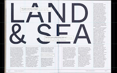
Layout Dissection
 |
| Fig 5.13 Layout dissection 1 |
 |
| Fig 5.14 Layout dissection 2 |
 |
| Fig 5.15 Layout dissection 3 |
Fig 5.16 Layout dissection (PDF)
Determining Grids
Fig 5.20 book grid 1.0
Form and Movement
Black and white
Fig 5.20 book grid 1.0
Form and Movement
 |
| Fig 5.23 Form and movement 2 color (gif) |
PDF:
Fig 5.24 Form and movement 2 color (PDF)
Image
 |
| Fig 5.25 Form and movement with image (GIF) |
Fig 5.26 Form and movement with image (PDF)
Image and text
 |
| Fig 5.27 Form and movement with image and text (GIF) |
Fig 5.28 Form and movement with image and text (PDF)
Project 1
Text formatting
Fig 5.29 text formatting
Final illustrations
 |
| Fig 5.30 Final Illustration 1 |
 |
| Fig 5.31 Final Illustration 2 |
 |
| Fig 5.32 Final Illustration 3 |
 |
| Fig 5.33 Final Illustration 4 |
 |
| Fig 5.34 Final Illustration 5 |
 |
| Fig 5.35 Final Illustration 6 |
 |
| Fig 5.36 Final Illustration 7 |
 |
| Fig 5.37 Final Illustration 8 |
 |
| Fig 5.38 Final Illustration 9 |
 |
| Fig 5.39 Final Illustration 10 |
 |
| Fig 5.40 Final Illustration 11 |
 |
| Fig 5.41 Final Illustration 12 |
 |
| Fig 5.42 Final Illustration 13 |
 |
| Fig 5.43 Final Illustration 14 |
 |
| Fig 5.44 Final Illustration 15 |
 |
| Fig 5.45 Final Illustration 16 |
 |
| Fig 5.46 Final Illustration 17 |
Final Illustrations Thumbnails:
PNG:
Fig 5.49 final illustrations thumbnails (PDF)
Project 2
Determining Grids
Fig 5.50 Three grid options (PDF)
Fig 5.51 Final Grid Option
Type specimen sheet:
4 options:
Fig 5.52 Type Specimen Sheet: 4 typeface options
Fig 5.53 Final option for typefaces
Book
Spreads in images:
Spreads in images:
 |
| Fig 5.54 Spread 1 |
 |
| Fig 5.55 Spread 2 |
 |
| Fig 5.56 Spread 3 |
 |
| Fig 5.57 Spread 4 |
 |
| Fig 5.58 Spread 5 |
 |
| Fig 5.59 Spread 6 |
 |
| Fig 5.60 Spread 7 |
 |
| Fig 5.61 Spread 8 |
 |
| Fig 5.62 Spread 9 |
 |
| Fig 5.63 Spread 10 |
 |
| Fig 5.64 Spread 11 |
 |
| Fig 5.65 Spread 12 |
 |
| Fig 5.66 Spread 13 |
 |
| Fig 5.67 Spread 14 |
 |
| Fig 5.68 Spread 15 |
 |
| Fig 5.69 Spread 16 |
Fig 5.70 Reunited - Book cover spreads (inside and outside)
PNG:
 |
| Fig 5.71 Final Book Thumbnail (PNG) |
 |
| Fig 5.72 Final Book Thumbnail (PNG) |
Fig 5.73 Reunited - Final book thumbnail
Fig 5.74 Reunited - Final Book Spreads
Mock Ups
 |
| Fig 5.75 Book cover mock up |
 |
| Fig 5.76 Book spread mock up |
E-book
Fig 5.77 Reunited in Flip HTML5
Final Project
Brand Guide
Adobe Interactive PDF
*Please download the file and open in Adobe Acrobat Reader to view the interactive logo animation.
Fig 5.78 Post Rate Brand Guide (Adobe Interactive PDF)
EPUB
After downloading, view it in Adobe Digital Editions
3. REFLECTION
Experience
Publishing design was quite fun for me, although sometimes I may forget the "fixed rules". In the start of the semester, we had to come up with a story / find a story with a word limit. Searching and writing the story was challenging for me, because I did not have enough time. For the exercises, I like how the form and movement exercise is slowly introduced with just basic form, followed by colour, image and text. Project 1 which is generating content especially the visuals was the hardest for me, as I chose to do watercolor illustration. It took me around 6 hours or more for high detailed visuals, so it was quite tiring for me and I required more time to complete them. Project 2, book design was scary at the start, but after practicing and getting familiar with the layout, it became easier. The brand guide (Final project) was applying what we've learnt from the exercises to project 2.
Observation
In the start of the semester, everything was quite rushed. However, once we have completed the visuals (project 1), the pace slowed down a little. Mr Vinod was very thorough when teaching us how to design the book. As for the final project, it is merged with brand corporate identity's final project, so the workload was not as heavy as the students from the previous semester.
In the start of the semester, everything was quite rushed. However, once we have completed the visuals (project 1), the pace slowed down a little. Mr Vinod was very thorough when teaching us how to design the book. As for the final project, it is merged with brand corporate identity's final project, so the workload was not as heavy as the students from the previous semester.
Findings
This module refreshed what I've learnt in typography and advanced typography modules. It has allowed me to apply the knowledge and also learn more about publishing design such as signature folding system, Van de Graaf grid and many more. My favorite is form and movement exercise. Although it was challenging in the start, practice made it easier and set a foundation for me when designing a book. It always reminds me to avoid predictability but still have a consistent layout when designing a book.
This module refreshed what I've learnt in typography and advanced typography modules. It has allowed me to apply the knowledge and also learn more about publishing design such as signature folding system, Van de Graaf grid and many more. My favorite is form and movement exercise. Although it was challenging in the start, practice made it easier and set a foundation for me when designing a book. It always reminds me to avoid predictability but still have a consistent layout when designing a book.


Comments
Post a Comment