Publishing Design - Exercises
Publishing Design - Exercises
Wong Kai Yi (0340236)
Publishing Design
Exercises
1. LECTURE
Fig 1.1 Formats
Formats
Civilizations:
Mesopotamian
Pictographic writing on clay tablets
Ancient Egyptian
Hieroglyphics is wrote on special type of paper - papyrus.
Indus Valley
Cuneiform is one of the earliest systems of writing (written on soft clay tablets)
Han Chinese
Chinese characters are written in vertical columns, a thin strip of bamboo is ideal for a single column
Earliest printed book: Chinese, end of T'ang dynasty (paper scroll using Chinese wood blocks - movable type)
European
Parchment (animal hide)
Paper becomes widely used
Fig 1.2 History of Print
History of Print
2-8th century AD China
6 main classics of Confucianism carved in stone
AD 750-768
Hyakumantō Darani: large-scale woodblock printing (earliest recorded uses of woodblock printing in Japan)
AD 868 China
First printed book: Chinese (end of T'ang dynasty)
Movable type: from the 11th century
separate ready-made characters
concept experimented in China
AD c.1400
Woodblock printing introduced in Europe
AD 1438 - 1457
Gutenberg & Western printing
Individual letters (metal)
Gutenberg Bible
Fig 1.3 Typography Redux
Typography Redux
Legibility
1. open and well proportioned text typefaces
Underlining: underline should be lowered so that they do not touch the characters as this impedes readability
Small Caps: subheads / first line of paragraph
All Caps: short headlines / subheads
never in long sentences and for emphasis
Never pseudo-condense or pseudo-entend font by horizontally / vertically squeezing / stretching a font
Outline & shadow
Takes many years of experience before one can format text beautifully and effectively. Avoid these as far as possible.
Type size, line length, line spacing
50-65 characters per line
overly long / short lines of type tire the reader & destroy a pleasant reading rhythm
Kerning & Tracking
Word spacing, factors that determine correct word
spacing includes typeface which is chosen, the size
and weight of the type.
Consistent word spacing provides an even
typographic “colour” a term referring to the overall
lightness and darkness of the text.
Fig 1.4 The Grid
The Grid
Using the grid, the designer can favorably use it to arrange his texts, photographs and diagrams in
a coherent and functional manner. This creates a sense of compact planning, intelligibility and clarity and suggests orderliness in design. Information that is presented in clear and logically set out titles, subtitles, texts, illustrations and captions will not only be read more quickly and easily but the information will also be better understood and retained in the memory.
The grid allows for flexibility, but it must have a limit when using within a book in order to maintain a certain amount of continuity / coherence in outlook / navigation.
Fig 1.5 Elements
Elements
1. Type
2. Colour
3. Image
The format and grid hold these elements together.
Variation
Create variation within the layout (but maintain consistency) to avoid predictability. This can be seen through the form and movement exercise.
Using a grid system, create variation. You can reuse and rotate the formulas in the book (each spead does not have to be different).
Surprise the reader at every page turn.
A good book takes its reader on a journey without the reader even knowing it.
2. INSTRUCTIONS
Exercises
28.08.2020 (Week 1)
Determining book size
We are to take an A3 paper or stick 2 A4 papers together then fold it into half. After that, we have to determine our book size by making at least 3 sizes which are between A5 to A4.
We are to take an A3 paper or stick 2 A4 papers together then fold it into half. After that, we have to determine our book size by making at least 3 sizes which are between A5 to A4.
 |
| Fig 1.6 determining book size - red line (chosen size) |
 |
| Fig 1.7 determining book size - 32 pages cut out (untrimmed) |
 |
| Fig 1.8 determining book size - opened book (untrimmed) |
Here is a video of how it looks:
Fig 1.9 paged book before trimming
Fig 1.10 Van de Graaf grid and with text
04.09.2020 (Week 2)
Text formatting
Fig 1.11 text formatting 1.0
Trimming the 32 paged book
The pages of the book from week 1 was not trimmed, so we had to trim them with a metal ruler and a blade.
 |
| Fig 1.12 trimming with metal ruler and blade |
 |
| Fig 1.13 Final 32 paged book |
 |
| Fig 1.14 Final 32 paged book |
 |
| Fig 1.15 Final 32 paged book |
 |
| Fig 1.16 Final 32 paged book |
Signature Folding System
The signature folding system is where one sheet of paper will be folded into a 16 paged notch.
Initially, I folded wrongly so I tried again.
The signature folding system is where one sheet of paper will be folded into a 16 paged notch.
Initially, I folded wrongly so I tried again.
 |
| Fig 1.17 Signature folding system 1 |
 |
| Fig 1.18 Signature folding system 2 |
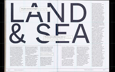
Layout Dissection
We had to choose 3 layouts to be dissected. Mr Vinod stated that the dissection will help us to understand what the designer was thinking during the process of designing.
 |
| Fig 1.19 Layout dissection 1 |
 |
| Fig 1.20 Layout dissection 2 |
 |
| Fig 1.21 Layout dissection 3 |
Fig 1.22 Layout dissection (PDF)
11.09.2020 (Week 3)
Determining Grids
We were to determine 3 grid structures for 3 layouts using Lorem Ipsum text.

Fig 1.23 grid layout 1

Fig 1.24 grid layout 2

Fig 1.25 grid layout 3
Fig 1.26 book grid 1.0
Form and MovementWe are to try one layout of form and movement in InDesign, to be shown on week 4.
After receiving feedback during class, I made some changes and made another layout.
 |
| Fig 1.23 grid layout 1 |
 |
| Fig 1.24 grid layout 2 |
 |
| Fig 1.25 grid layout 3 |
Fig 1.26 book grid 1.0
Form and Movement
Fig 1.27 Form and movement 1
18.09.2020 (Week 4)
I tried to do another version of form and movement.
 |
| Fig 1.28 Form and movement 2 |
We were also busy completing visuals for the book.
25.09.2020 (Week 5)
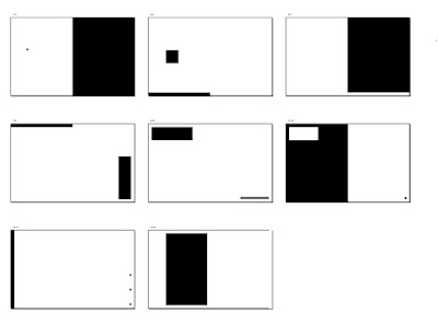
After receiving feedback multiple times, this is the final outcome of form and movement in black and white.
Gif:
 |
| Fig 1.29 Form and movement 2 final (bw) |
 |
| Fig 1.30 Form and movement 2 final (bw) GIF |
Here is the PDF for form and movement 2 (bw):
Fig 1.31 Form and movement 2 (bw) PDF
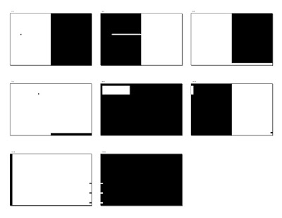
Then, we proceeded with adding one color to the previous exercise.
My attempt:
 |
| Fig 1.32 Form and movement 2 color |
 |
| Fig 1.33 Form and movement 2 color (gif) |
PDF:
Fig 1.34 Form and movement 2 color (PDF)
02.10.2020 (Week 6)
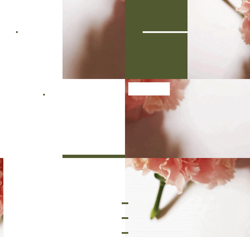
Form and movement with image: |
| Fig 1.35 Form and movement with image (GIF) |
Fig 1.36 Form and movement with image (PDF)
Form and movement with image and text:
 |
| Fig 1.37 Form and movement with image and text (GIF) |
Fig 1.38 Form and movement with image and text (PDF)
3. FEEDBACK
28.08.2020 (Week 1)
Specific feedback: Good book size, clear image.
04.09.2020 (Week 2)
Exercises:
General feedback:
We have to trim the edges of the book with a blade slowly.
Update the blog on time to show our progress.
Specific feedback:
Formatting text: The 3000 words can exceed slightly, not a problem. For this exercise, we also need to embed into our porject 1 blog post. Highlight the text which is to be illustrated.
Project 1:
General feedback:
References should include everything that we refer to, and to be written in APA style.
Specific feedback:
I do not need to shorten the story because it slightly exceeds the 3000 word count.
11.09.2020 (Week 3)
General feedback:
What determines the look and feel of a book is the margins. The text must fill in margin to show the margins of the book. Our visuals should have 3 layers: detail (roughly 8), mid detailed (roughly 8) and minimal detail (4-6).
Specific feedback:
Visuals do not necessarily be the literal meaning of the text. They can be abstract which does not bring out the literal meaning. This makes the readers want to know what happens next. I can check out Tara Books for reference of different art styles.
18.09.2020 (Week 4)
General feedback:
Form and movement: it cannot be decorative in nature, it just has to be simple. The forms can represent text, image and color.
Grids: Never confuse your reader. The margins are for you to fill up with text, so the overall layout is achieved in balance.
Book design: Do not start a chapter in the same spread.
Specific feedback:
Form and movement: The continuity of forms are sometimes not there, so I have to change them and try it again.
Grids: 1st layout: no title, overall is ok.
2nd layout: Pull quote can be over the whole spread (suggestion).
3rd layout: Pull quote can be wrapped in body text (suggestion).
25.09.2020 (Week 5)
General feedback:
For book design: Start your book design simple, and build it layer by layer.
Specific feedback:
Form and movement: 2nd and 4th spread requires changes. After many changes, the exercise is approved.
02.10.2020 (Week 6)
General feedback:
For form and movement with image, you can choose a color from the image which is least used to be the color for the other forms in the layouts.
Specific feedback:
Form and movement with image: After changing the green, can try a lighter shade to see if it works.
4. Reflection
For the book making in week 1 and week 2, it gave me an insight on how book pages are constructed. I have learnt a lot on the exercises on how the books work. E.g. paging, trimming edges
For the layout dissection exercise, it is very interesting for me to interpret what the designers are thinking when constructing the layout. It gives me a deeper insight on how the process of designing affects the layout. Continued by determining book grids, I find it very interesting and fun to play with. Balance is important, not just about putting form into them but actually utilizing white space in the spreads.
Form and movement exercise has been tough because it is something which is quite new to me. Throughout the entire process, from black and white all the way to image and text, I slowly saw the beauty and interaction of the spreads with each other. I struggled initially, but slowly I kind of understood how it works.
5. FURTHER READING
28.08.2020 (Week 1) - 04.09.2020 (Week 2)
Title: Layout Essentials: 100 Design Principles for Using Grids by Beth Tondreau

Fig 1.37 Layout Essentials (front cover)
This book explains about how to use grids when designing layouts. Determining the number of columns by assessing the materialSingle-column grid: For continuous text, such as a book or an essay. It is less intimidating and more luxurious, which makes it suitable for catalogs and art books.Two-column or multicolumn grid: For flexibility. It can have the greatest number of variations because the columns can be further broken down. It is usually used for websites, newspapers and magazines. For a lot of information, a modular grid arranges the units of information into manageable chunks. All grids create order.
 |
| Fig 1.37 Layout Essentials (front cover) |
This book explains about how to use grids when designing layouts.
Determining the number of columns by assessing the material
Single-column grid: For continuous text, such as a book or an essay. It is less intimidating and more luxurious, which makes it suitable for catalogs and art books.
Two-column or multicolumn grid: For flexibility. It can have the greatest number of variations because the columns can be further broken down. It is usually used for websites, newspapers and magazines.
For a lot of information, a modular grid arranges the units of information into manageable chunks.
All grids create order.
11.09.2020 (Week 3) - 18.09.2020 (Week 4)
Title: Design Elements: Understanding the Rules and Knowing when to Break Them - Updated and Expanded by Timothy Samara
Form and SpaceThe Shape of Space (format)Definition: the proportional dimensions of the space where form is going to do its thing is something to think about.The size of the format space compared to the form within it, will change the perceived presence of a form. For example, a smaller form within a larger spatial format will be perceived differently from a large form in the same format. It is a message that has to be controlled.A small format enhances the presence, or apparent mass, of an element; a larger format decreases the presence of an element with the same physical size.
Form and Space
The Shape of Space (format)
Definition: the proportional dimensions of the space where form is going to do its thing is something to think about.
The size of the format space compared to the form within it, will change the perceived presence of a form. For example, a smaller form within a larger spatial format will be perceived differently from a large form in the same format. It is a message that has to be controlled.
A small format enhances the presence, or apparent mass, of an element; a larger format decreases the presence of an element with the same physical size.
25.09.2020 (Week 5) - 02.10.2020 (Week 6)
Title: Making and Breaking the Grid by Timothy Samara
Alternative Architectures - Grid Deconstruction: OrthogonalSplitting, Splicing and ShiftingOrthogonal is in right angles. The process starts with a base grid. Then, the designer manipulates how columns and rows relate and interact with each other. The results might have overlapping information, creating situations where foreground and background appear to swap places. Designers can use different axes of alignment to explore a more dynamic architectural space. Overlapping grids with modules of different proportions can introduce a kind of order to the directional and spatial ambiguity that layering creates.
Title: Making and Breaking the Grid by Timothy Samara
Alternative Architectures - Grid Deconstruction: Orthogonal
Splitting, Splicing and Shifting
Orthogonal is in right angles. The process starts with a base grid. Then, the designer manipulates how columns and rows relate and interact with each other. The results might have overlapping information, creating situations where foreground and background appear to swap places. Designers can use different axes of alignment to explore a more dynamic architectural space. Overlapping grids with modules of different proportions can introduce a kind of order to the directional and spatial ambiguity that layering creates.


Comments
Post a Comment