Brand Corporate Identity - Project 2
Brand Corporate Identity - Project 2
Wong Kai Yi (0340236)
Brand Corporate Identity
Project 2
1. LECTURE
2. INSTRUCTIONS
Progress
11.09.2020 (Week 3)
After checking our brand profiles, Mr Vinod explained to us how our brand profile was supposed to be. The brand value is a bigger aspect for the brand.
18.09.2020 (Week 4)
Brief Brand Profile for my brand:
Fig 2.1 Brand Profile
25.09.2020 (Week 5)
For the progression, we are to do:
1. mindmap keywords
2. sketches (ideas and concepts)
3. finalize sketches
4. digitization 3 chosen ideas
5. rationale
My mindmap for my brand is as below:
 |
| Fig 2.2 keywords mindmap |
Then I drew the mindmap of possible symbols for the logo:
 |
| Fig 2.3 symbols mindmap |
Ideas and concepts:
 |
| Fig 2.4 Idea 1: video + rating |
 |
| Fig 2.5 Idea 2: community + rating |
 |
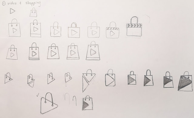
| Fig 2.6 Idea 3: shopping + video |
 |
| Fig 2.7 Idea 4: shopping + video |
Upon receiving feedback, ideas 1 to 3 did not work. Therefore, I had to come up with 2 more ideas to show Mr Vinod during class.
Below is more ideas:
 |
| Fig 2.8 Idea 5: products + video |
 |
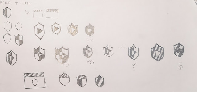
| Fig 2.9 Idea 6: trust + video |
After receiving feedback, I chose three to be finalized into new sketches.
 |
| Fig 2.10 Finalizing Idea 4: shopping + video (New Idea 1+2) |
 |
| Fig 2.11 Finalizing Idea 5: product + video (New Idea 3) |
 |
| Fig 2.12 Finalizing Idea 6: trust + video (New Idea 4) |
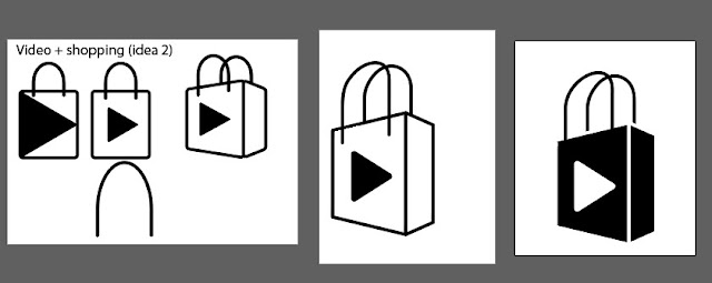
Then, I proceeded with the digitization.
 |
| Fig 2.13 Digitization of New Idea 1 |
 |
| Fig 2.14 Digitization of New Idea 2 |
 |
| Fig 2.15 Digitization of New Idea 3 |
 |
| Fig 2.16 Digitization of New Idea 4 |
02.10.2020 (Week 6)
Progress
After showing Mr Vinod the logos, I did more exploration with New idea 2 and 3.
 |
| Fig 2.17 variation of idea 2 |
 |
| Fig 2.18 variation of idea 3 |
After receiving feedback, I decided to go with idea 3. The images below are the progress of idea 3.
 |
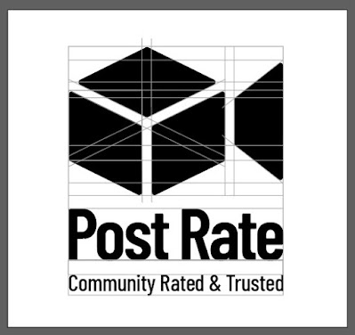
| Fig 2.19 Post Rate logo exploration |
I tried to adjust the height and width of the 'box' part, and also the lines between the box panels. I also chose a few typefaces and finally decided to go with Barlow Condensed Semibold for the brand name.
Space rationalization:
1. logo only
2. brand name
3. tagline
Primary option:
 |
| Fig 2.20 Space rationalization 1 |
 |
| Fig 2.21 Space rationalization 2 |
 |
| Fig 2.22 Space rationalization 3 |
 |
| Fig 2.23 Space rationalization 1 |
09.10.2020 (Week 7)
Upon receiving feedback, Mr Vinod suggested that I change the tagline from "Meant to Share" to "Community Rated & Trusted".
Space Rationalization:
 |
| Fig 2.24 Space rationalization 3 |
I did several patterns using the pattern function in Illustrator.
Watch the video here: How to Create Patterns in Adobe Illustrator
 |
| Fig 2.25 Pattern 1 |
 |
| Fig 2.26 Pattern 2 |
Final Submission for Project 2:
Fig 2.27 Project 2 (items 1-8) version 1
16.10.2020 (Week 8)
Logo animation (item 9) |
| Fig 2.28 Logo animation 1 |
 |
| Fig 2.29 Logo animation 2 |
 |
| Fig 2.30 Logo animation 3 (final) |
Final Submission:
Fig 2.31 Submission of Project 2 (items 1-8) (PDF)
 |
| Fig 2.32 Logo animation (final) |
28 Logos:
Fig 2.33 28 Logos submission
3. FEEDBACK
18.09.2020 (Week 4)
General feedback:
The value has to be a larger ideal. The flow is:
1. 3 questions
2. brand profile
3. mind map
4. sketches
Specific feedback:
My brand profile has some problems, as the value, proposition, positioning statement is not good. I have to change to make my brand special and unique. E.g. the value of Apple is not to sell hardware and software, but the company's products and service are the best among all the rivals so that customers will buy the products.
25.09.2020 (Week 5)
General feedback:
We have to show the entire progression from the keywords derived from brand profile up to the concept and ideas for logos. By doing so, the client will understand where the logo came from. We have to show digitized version of the 3 ideas that we have chosen next week.
Specific feedback:
For the 3 chosen ideas, do the sketches on a new sheet of paper with the progress very clear.
FB: Do one more logo from idea 3. (total digitizations to be shown: 4)
02.10.2020 (Week 6)
General feedback:
For the rationalization, we should set an x-height, and use it as a reference for other parts of the construction. Rationalizing space using elements. For the minimum size, do it in 10mm, 15mm, 20mm and 25mm. It is done to check the visibility of your logo if you are a sponsor. We can start registering gmail account for the brand to be use to open social media accounts. By next week, we need to have:
1. Logo Space Rationalisation (Final) Grid lines (grey)
- Logo with Brand Name (chosing typeface 12+)
- Brand Name with diff positioning (10+)
2. Logo Sizing
3. Logo in BW, reverse & colour (1/2)
3) Logo with strapline (space rationalised too)
4) Logo with rationale (brand ideals, logo explained)
5) Logo min. size
Specific feedback:
Ideas 2 and 3 work, can continue with the progression. Finalized idea 3.
For idea 3 (parcel box + video), the rationalization must be done in vertical and horizontal lines. Can try to slightly round the edges of the logo. The type choice is good (Barlow Condensed) but the e is a little weird / not working. Can search for other fonts on Google fonts that is similar to Barlow.
09.10.2020 (Week 7)
General feedback:
Determine clear space: can either use x-height or another part of the logo. Patterns can be done in black and white, adjust the opacity.
Specific feedback:
The clear space for secondary logo option has to be larger.
16.09.2020 (Week 8)
General feedback:
The logo animation has to be relevant to the logo, not just applying an effect onto the logo.
Specific feedback:
Choosing the right color palette is important. My new color palette does not work, as the secondary colors are not secondary colors.
4. REFLECTION
18.09.2020 (Week 4) - 16.09.2020 (Week 8)
In these few weeks, it has been quite challenging for me. This was because we never had modules similar to this module before. The process of sketching was one of the most challenging, because it was maxing out my brain for ideas. Mr Vinod said that we needed to have at least 3 sheets of sketches. However, I managed to do the sketches and came up with the idea. The initial stage was tough, because of the overflow of information, which makes me unsure of which to proceed with and how it will become. After sketching and choosing the best out of each idea, the digitization was easier. I slowly got a sense of direction on where I was going with the brand.
I've learnt that it is important to have come up with many sketches and choose from them. Otherwise, I would not have come up with the best ideas which will be developed in the logo and branding.
5. FURTHER READING
18.09.2020 (Week 4) - 25.09.2020 (Week 5)
Title: Logo Design: Tips to Create the Perfect Logo for Your Business
Fig 2.34 YouTube video by Visme
Logo is the first impression of a company. It is also a representation of what a brand stands for. It includes value, mission etc.
BRAINSTORMFind the right time to brainstorm.2. Stay focused3. Write everything down (on a paper)4. Revisit your ideas after 24 hours (helps to decide what will work)
2. Story, Goals, Mission Statement - Logo resonates with your brand.
1. A - adjectives to describe your brand 25, narrow down to 5
2. Create the ideal perception
3. EmotionWhat you want them to feel when looking at your logo.
3. Create an inspiration boardDesign - fonts, colors etc
4. Determine the type of logos
5. Font, Color and Style. Font match the adjectives for your brand. Colors determine how you're perceived. Style: Vintage, floral, etc
Fig 2.34 YouTube video by Visme
Logo is the first impression of a company. It is also a representation of what a brand stands for. It includes value, mission etc.
BRAINSTORM
Find the right time to brainstorm.
2. Stay focused
3. Write everything down (on a paper)
4. Revisit your ideas after 24 hours (helps to decide what will work)
2. Story, Goals, Mission Statement - Logo resonates with your brand.
1. A - adjectives to describe your brand
25, narrow down to 5
2. Create the ideal perception
3. Emotion
What you want them to feel when looking at your logo.
3. Create an inspiration board
Design - fonts, colors etc
4. Determine the type of logos
5. Font, Color and Style.
Font match the adjectives for your brand. Colors determine how you're perceived. Style: Vintage, floral, etc
18.09.2020 (Week 6) - 25.09.2020 (Week 7)
Title: Marketing Color Psychology: What Do Colors Mean and How Do They Affect Consumers?
Fig 2.34 YouTube video by Visme
This video explains the basics of colors such as hue, saturation and tint. It also talks about the primary, secondary and tertiary colors. The color wheel, consists of warm and cool colors which affects the emotion and feeling of a person. Complementary colors are colors opposite of each other in the color wheel. Avoid using 50/50, use 80/20. Analogous - colors next to each other. Calmness and nature. 1 dominant 2 accents. Monochromatic - 1 color and alter the tint and hue. Triadic - triangle from the color wheel.


Comments
Post a Comment