Major Project
Major Project
Wong Kai Yi (0340236)
Major Project
Module Information Booklet (MIB)
Major Project MIB
Week 1
We had physical class in campus, Mr Asrizal briefed us on our major project. He also showed us some of our seniors' works.
For our major project, there are 3 ways of coming up with the idea:
1. From our dissertation
2. Find a client
3. UN SDG Goals
Week 2
Figma board: Click here to view
I came up with 2 ideas.
Idea 1:
An application for Animal Shelters
SDG Goal: 9 Industry, Innovation and Infrastructure
Target 9.B Support domestic technology development, research and innovation in developing countries, including by ensuring a conducive policy environment for, inter alia, industrial diversification and value addition to commodities
However, when coming up with this idea, the concern of the cost and feasibility of the app was brought up. Since an application with such functions requires high maintenance and cost, and the target audience are shelters and animal lovers, it is quite difficult to upkeep the platform.
The additional step to create an account (1) solves the problem but also (2) creates an extra step for those who want to donate one time. The creation of an account is an extra step for users, so it might hinder them from donating. My initial idea was that the account is created once, and the user can connect payment methods once, so for future donations, it would be much easier. There is also automated receipt generation, so the admin step is reduced.
Mr Asrizal:
Idea 2:
Merchandise: Raise Awareness regarding Life Below Water
SDG Goal: 14 Life Below Water
Target 14.5 By 2020, conserve at least 10% of coastal and marine areas, consistent with national and international law and based on the best available scientific information.
 |
The goal of this series of merchandise is to raise awareness on water pollution and educate people on how to take care of the environment. Using fascinating deep sea creatures illustrations as the main visuals, they will be applied to a series of merchandise and book to educate the people. For interactivity, there will be QR code where the user can scan and watch a simple animation of the sea creatures.
Deliverables include (but not limited to):
- illustration
- poster with fun facts, interactive (scan QR short animation video)
- info book (facts about the sea creatures + real image)
- merchandise (environmental friendly)
- match the cards game
- WhatsApp / telegram stickers
- IG gifs
- phone wallpaper
Idea 3: Self care kit
SDG Goal: 3 Good Health and Well-being
Target 3.4 By 2030, reduce by one third premature mortality from non-communicable diseases through prevention and treatment and promote mental health and well-being.
Idea 1: The first app idea is not very persuasive as the cost of building and maintaining the app is quite high, and since it's for animal shelters, it is not a very good idea to proceed with. Additionally, while you were trying to solve a problem, you unknowingly made the process more complicated for the users. Take note that donations can now be done directly with QR code, and if your app requires users to create an account etc, the steps increased and thus making the idea not really solving the problem.
Idea 2: For the sea creatures idea, the direction is there, but not quite on track yet. Will have to further explore and see which specific goal that I am trying to solve. Worth exploring, has potential to expand it.
Idea 3: Self care kit. Possible to combine with idea 2.
Overall feedback: Compile the idea into a pitch deck, easier to understand. (Was doing on Figma)
Week 3
I was sick for the whole week, so I consulted with Mr Asrizal on Week 4's Monday.
I combined idea 2 (sea creatures) and idea 3 (self care kit), and below is the first pitch deck.
Mr Asrizal:
The big idea of a kit is fine, however the detail content of the activity proposed in the kit needs to be explored further. As you're going to UNSDG path, the solution/idea needs to carry an impact towards the cause that you're championing. The impact have to be measured.
Therefore, it gotta be bigger than providing awareness and knowledge. There's gotta be a call-to-action (CTA) to the audience. Meaning, after they consume the educational kit, then what's next? how does it help the SDG goals you're trying to achieve?
Week 4
Mr Asrizal:
I showed the deliverables, but Mr Asrizal said that I need to do the survey and create the personas to make sure the target audience and understand their pain points. Only after that, the deliverables can be determined to suit the pain points of the target audience.
Regarding the call-to-actions to track the impact, it is acceptable, but the specific content has to be based on the research from the survey. For the week, I just need to do survey, research and personas.
Week 5
I started working on the survey to get primary data to better understand the target audience and their lifestyle. I prepared the questions and sent out the survey. Here are the survey results and analysis. To view in Figma, click here.
Survey Introduction
Survey Questions (Google Forms)
Survey Results
Survey Analysis
To view on Figma, click here.
Empathy Mapping
1. University Students
2. Working Young Adults
User Personas
Good research, suggested to remove the sea creatures idea as it does not match the target audience (childish). Other than that, okay with the idea and proceed with the moodboard, style, etc. Additionally, Mr Asrizal asked me to consult with Ms Petrina regarding the idea as she can provide professional output regarding mindfulness.
Then I consulted with Ms Petrina on Wednesday. She thinks that it is a good idea backed up by research, and gave me a few suggestions on the mindfulness activities that I can include in the activity book. I will compile them after doing research on my side as well, and ask for feedback next week.
Below is the screenshot of the zoom meeting with Ms Petrina.
Week 6 (No consultation - Hari Raya)
Week 7
I looked updated the deliverables, as well as the moodboard to after eliminating the SDG 14 (Life on Water).
For the design style, I am going for a retro gradient style, but the colors will be more pastel as the tone of the self-care kit is to be relaxing. The target audience is also young adults, so it has to suit their taste.
Name of Product: The Present
- Can be understood as “being in the present” and also “a gift for someone”. With this self-care kit, the user can “be in the present” when they do the activities This self-care kit can be “a present” for someone or yourself.
Exploration:
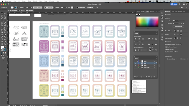
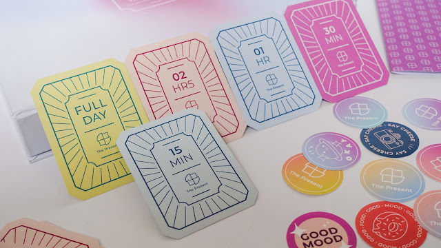
Color coded (gradient) cards:
Presentation (Week 7)
Week 7 Consultation PDF Slides
Mr Asrizal:
Okay with the design direction. However, I have to further research and confirm the number of cards, leisure and mindfulness activities (based on credible sources) and the packaging.
Week 8 Evaluation Presentation
Evaluation Presentation Slides
Feedback from Lecturers:
Good job, design direction is good, idea is approved, agree with "scrolling through social media for hours, unknowingly wasted time".
Since I worked on the cards design first instead of the logo, it will be quite challenging for me as it will be "reverse engineering" by using the application of design the cards and derive a logo that fits the style. The other feedback was that the front of the card design looks good, but the back could also use the same style, which is "visible grids / lines" to put the information instead of just everything being middle aligned.
Week 9
No consultation
Week 10
Logo Design
Inspiration is a clock + present
Initially, I decided to use the Serif typeface "Vidaloka" for the logo typeface, but it felt off. So I decided to use Montserrat.
I used the grids to design the logo and set the spacing between the type and the logo.
Testing the logo color in black, white and line color on the gradient background of the cards.
Test print
All
Logo
I realized that the colors for cards "02 HRS" and "FULL DAY" are the same, so I changed the color.
The layout hasn't been changed yet, as this is just for me to test print the gradient colors. Overall the printed colors look ok, just that I am not quite sure on what is wrong with the gradients.
Cards
These are some references for the card back, with train tickets as the design style and theme. Something modern, clean and orderly.
This is the previously stated deliverables, might subject to change but is most likely fixed in this way. Additional information on future growth and expansion to make the product sustainable.
- Logo
- Cards + Illustration
- Packaging
- Activity book
- Extras (stickers, letter paper and postcard)
- Print physical item, laser cut + assembly
- Website
- Social media
Feedback from Mr Asrizal:
Logo: try to remove the dot at the end when the logomark is presented with the typeface. But can use when it is just the wordmark.
For the logo on gradient background, it is ok to go with white or a darker hue of one of the colors. Depends on the personality I am going for. Black is too attention grabbing.
The gradient printing problem might be due to the printer being not able to detect certain colors.
Packaging: Consult with Mr Shamsul on the packaging of the product. Suggested that Mummy printing has high quality printing.
Suggested to work on packaging first, then only do the cards.
Feedback from Mr Shamsul:
Provided suggestions on the materials for the box and cards. Come up with a mockup for the packaging to show next week. Look at the packaging materials in campus.
Week 11
I found these few websites helpful for my packaging design
Materials for Box:
- Printed outer paper: 100 / 120 gsm paper
- Printed inner paper: inside 80gsm
- Inner hard board: grey board 2mm-3mm
- Tray insert: art card 200gsm NOT model board
- Glue: cow gum (outer layer) and PVA glue (base)
- Magnets & metal plate
* check out the paper finishing before printing
Materials for book:
Materials for card:At least 300 gsm
Progress:

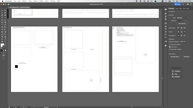
Draft of box size

Layout of items in the box

Inside of magnet flap box

Magnet flap box, envelope, mailer, tray insert

Messy room #graphicdesign
Here is a video showcase of the packaging mockup:
Meeting with Mr Shamsul:
Feedback from Mr Shamsul:Good progress, double confirm with me on the print materials and thickness. Suggested to print at Angel > Mummy. But I will try Arch Print as well.
Cannot do matte lamination because it will be quite costly as they have MOQ for it. I will try to print one set of cards from China with matte lamination, but also print locally and see the outcome. *Mr Shamsul stated that if I print from China and locally, there might be a difference in quality so I have to think about that.
After consultation:I went to Exprint Mid Valley to look at the print materials and finishings. I also bought grey board and Elmer's glue for the packaging. Magnets bought from Shopee also arrived.
Books for reference (activity book)
Planning
Print list
Exprint Mid Valley pricingProgress is good. No issues. Remember to add the logo on the back of the card (the time side). Can do the laser cut with Jessica and Mr Shamsul on the same day. Burn marks might not be so visible.
- Printed outer paper: 100 / 120 gsm paper
- Printed inner paper: inside 80gsm
- Inner hard board: grey board 2mm-3mm
- Tray insert: art card 200gsm NOT model board
- Glue: cow gum (outer layer) and PVA glue (base)
- Magnets & metal plate
* check out the paper finishing before printing
 |
| Draft of box size |
 |
| Layout of items in the box |
 |
| Inside of magnet flap box |
 |
| Magnet flap box, envelope, mailer, tray insert |
 |
| Messy room #graphicdesign |
Books for reference (activity book)
Week 12
Illustration progress
Printed cardsPrinted at Arch PrintA3 260gsm art card
Some were printed wronglyProblems: Misalignment
Process
Laser cut grey board
Packaging box options
Week 14
Showcase
Instructions
Cards
Activity Book
Mailer (Postcards & Letter Set)
Postcards
Letter Set (Envelopes & Letter papers)
Stickers
Social Media
Social Media


.png)


.png)
.png)


Comments
Post a Comment