Creative Brand Strategy - Final Project
Creative Brand Strategy - Final Project

Wong Kai Yi (0340236)
Creative Brand Strategy
Final Project
1. INSTRUCTIONS
Progress
All references and progress are placed in the Figma board
03.06.2021 (Week 10)
Working on the logo


10.06.2021 (Week 11)
Finalizing Logo


17.06.2021 (Week 12)
Graphic elements

Posters progress


Ms Low gave suggestions that the dome shape can be used as placeholders
24.06.2021 (Week 13)
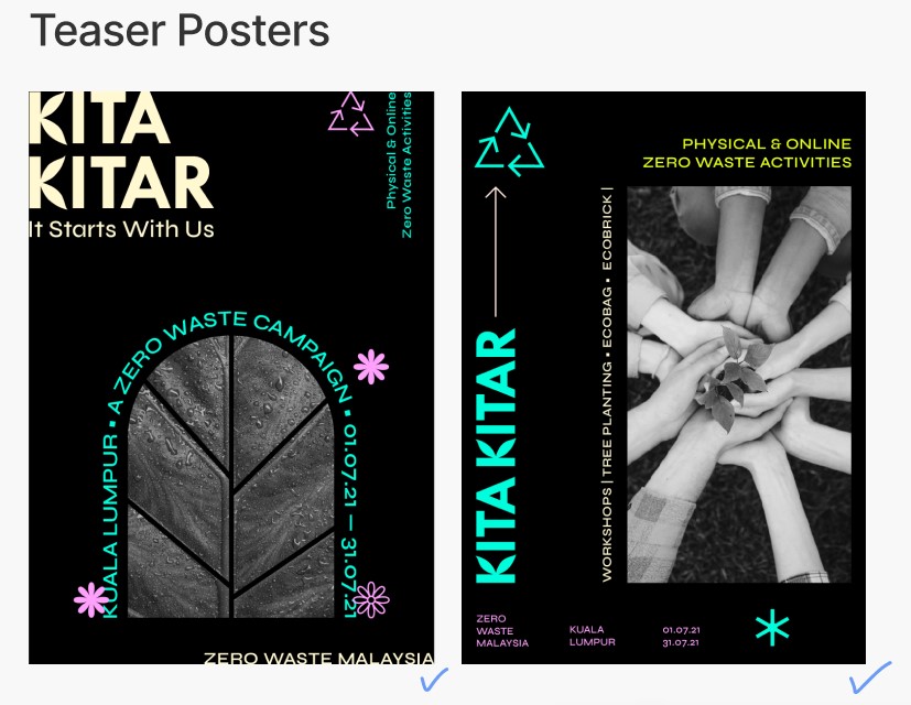
A3 Teaser Posters


01.07.2021 (Week 14)
Progress
Final touchpoints


Layout


Stamp

Remaining website, stickers, merchandise and mock ups are same as final submissions.
Final Submissions (PNG)
Pre-Event
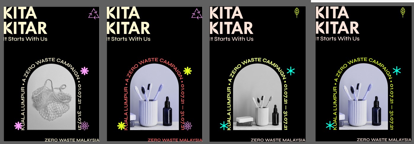
A3 Posters
Teaser Posters
 |
| Teaser poster 1 |
 |
| Teaser poster 2 |
Activities Posters
 |
| Activities poster 1 |
 |
| Activities poster 2 |
 |
| Activities poster 3 |
Mock Ups
 |
| 2 Teaser posters |
 |
| 3 Activities posters |
 |
| Teaser poster wall mock up |
 |
| Tree planting activity poster mock up |
Instagram - Pre-event & During event
Profile
 |
| Instagram profile |
Posts
Carousel
 |
| Carousel 1 |
 |
| Carousel 2 |
 |
| Tree planting activity carousel mock up (with CTA to join workshop at the end) |
 |
| About campaign carousel mock up (with CTA to follow at the end) |
 |
| Intro to campaign stories sequence (CTA at last story) |
 |
| Animated activity countdown story |
Posts and stories
 |
| Posts and story 1 |
 |
| Posts and story 2 |
 |
| Posts |
Stickers (GIF) - Pre-event & During event


Website
 |
| Website |
 |
| Website mock up 1 |
 |
| Website mock up 2 |
 |
| Website mock up 3 |
 |
| Website mock up 4 |
 |
| E-ticket |
During-Event
Stamp
 |
| Stamp 1 |
 |
| Stamp 2 |
Sticker
 |
| Sticker - square |
 |
| Sticker - circle |
 |
| Sticker on participant's shirt |
Post-Event
E-certificate
 |
| E-certificate |
Merchandise
Tags
100% ecofriendly, recyclable
 |
| Tags (stamped) |
 |
| Stamped sticker on bar soap 1 |
 |
| Stamped sticker on bar soap 2 |
 |
| Stamped tag with loofah 1 |
 |
| Stamped tag with loofah and soap |
Final Submission Presentation (PDF)
2. FEEDBACK
03.06.2021 (Week 10)
General Feedback:
Ms Low introduced Figma for us to share our work. Annotations can be easily done through Figma. We should work on the brandmark and key art at the same time instead of putting too much time into the brandmark only as it can be refined further down the road. The deadline is also extended to W15 due to our independent learning week in W8.
Specific Feedback:
1. The typography has to be put in context to see if it is suitable for the campaign.
2. Logo / brandmark: Take note on the weight of the elements in the K.
3. Photography: Identify the usage of the sets of photography that I have (inform & trigger).
4. Logo after feedback 2, Logo can have 2 variations, but try to stick to one so that it is more recognizable. The tagline for logo v1 can be adjusted so that it fits the width of the logo. Take note of the kerning of the letters. Refine the leaf tip so that it is not too sharp.
10.06.2021 (Week 11)
General feedback:
When choosing typeface / doing typography, remember to ask this question: Am I impressing or informing the reader?
Specific feedback:
Confirm style to retro modern, with minimal illustrations. Work fast to come up with the key artwork (poster).
17.06.2021 (Week 12)
General feedback: -
Specific feedback:
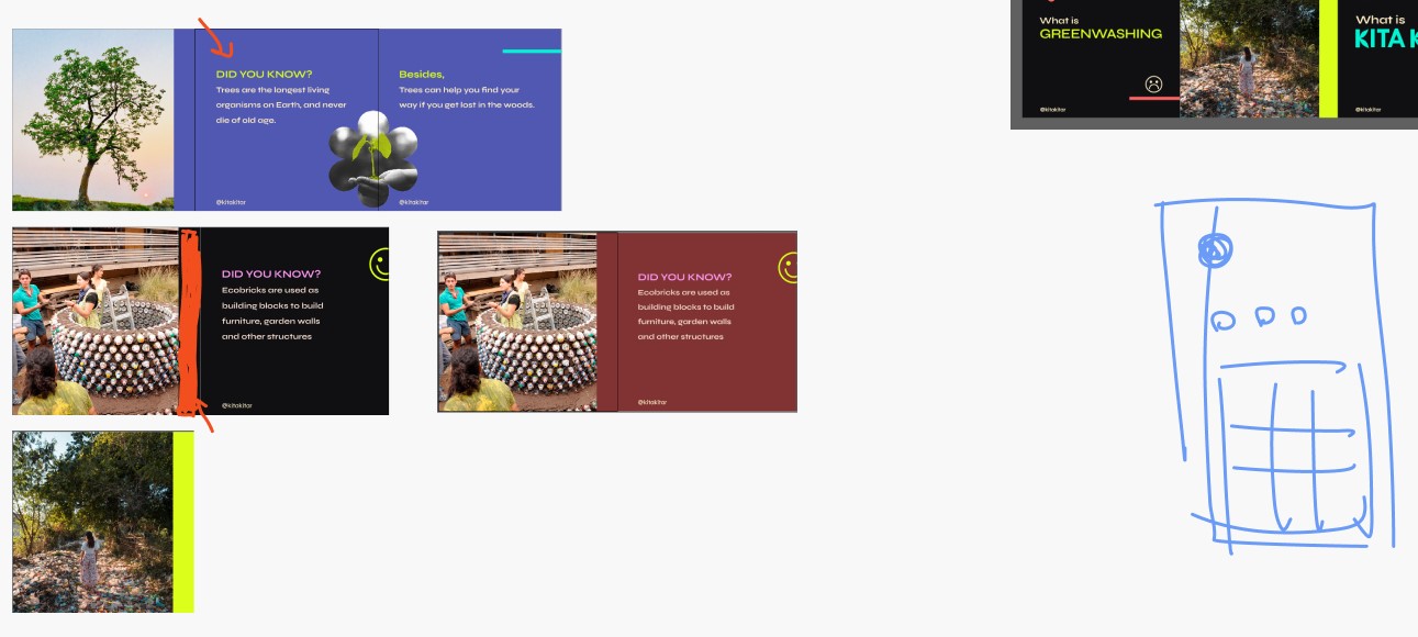
The posters' composition and style is good, but it lacks information. Remember the goal of the poster, which is to inform the public about the campaign. Try different placeholders for each activity. This helps to imprint and categorize the activities in the viewers' mind unknowingly.
24.06.2021 (Week 13)
General feedback:
Focus on the brand visual language. The main touchpoints to focus on are the posters, social media and website. These communicate the brand visual language the most, so it is important to create a strong visual language through these touchpoints. For the remaining touchpoints, if there aren't enough to be added up to 7, we can do some with template (stick the logo onto the merch).
Specific feedback:
The teaser posters are looking good. For the activities posters, Ms Low suggested that I do color coding for each activity. Additionally, try using generic shaped placeholders for the activity as I have used in the Tree Planting activity poster.
01.07.2021 (Week 14)
General feedback: -
Specific feedback:
Teaser posters are good, activities poster (the ecobrick bg can change to a darker salmon red).
IG posts and stories look good, remember to change the color for the ecobrick background. Do the social media mock ups to show what it looks like.
Work fast on the touchpoints, not much time left.
Friday:
Social media mock ups: Darker background looks better. buttons need to be more prominent, outline / shadow would helps.
Website: Buttons need to be more prominent & standardize. Outline the buttons / add shadow. Images for past events need to be bigger and clearer for the viewers. Try removing the placeholder shapes. "Back to top" button is usually placed in the center. Other than that, the website structure is practical.
08.07.2021 (Week 15)
Submission: Flat image (posters) and mock ups
Files: Weekend
E-portfolio: 15 July 2021
Include PNG of each item and slides (final project)
Final Project Presentation:
Use more motion graphics in the visuals
The way I explained the design direction is good, but I focused too much on the technical side. Try to describe the "unusual visual experience" through the posters etc. Design variety is not strong enough, I should try different forms of expression (can reference Atiqah and Adeel). To use the same elements repeatedly, while creating different varieties and maintaining consistency.
3. REFLECTION
I did not have enough time to complete the final project due to my slow progress in project 2. I learnt that I have to be quick in making my decisions on the campaign and art direction so that I will have enough time to work on my touchpoints properly. At the end of the semester, it was very rushed for me due to the heavy workload from other modules as well. On the other hand, the initial stage especially posters and social media were the ones that took more time to create, because the art direction and brand language will be seen through their designs. I also learnt that it is important to have a strong brand visual which communicates the correct messages to the target audience.
4. FURTHER READING
03.06.2021 (Week 10) - 01.07.2021 (Week 14)
Branding: What other people think about you, your product, company, or service.
Visual identity: What that brand looks like. Logo, color choices, images, type
Strong visuals are important
VI is like a preview of your brand, each part of your design is like a clue that tells the viewer what to expect. Tone
Every element works together to show what it looks like.
Logo: simple, recognizable
A literal brand, how people recognize you and identify your product / service
Color: Personality & style
black, grey, white, off-white
Type: Changes the look of the brand
2-3 fonts
Creative fonts: chosen with care, reflect unique visual identity
Images: Photo, graphic, icon, button
Professional: specifically made for the brand
Consistent: signature color, shared subject, consistent graphic style
Avoid generic and staged images, lack context, that appear frequently in other companies' designs
Use: genuine, feature authentic people, places and things


Comments
Post a Comment