Design Principles
Design Principles

Wong Kai Yi (0340236)
Design Principles
Exercises
Project 2: Self-portrait
Final Project
1. INSTRUCTIONS
FINAL PROJECT: CULTURAL RELATIONSHIP
Week 12 (11.11.2019) - Week 14 (25.11.2019)
After getting briefed by Ms Sherry and Dr Jinchi, I decided to go to Pasar Seni with my friend. We were to visit a place and make a piece of artwork where we show our relationship with culture. It does not necessarily have to be traditional culture, it could also be modern culture.
On 29th October 2019, my friend and I went to Pasar Seni. Along the streets of Petaling Street, we entered a place named Lost in Chinatown which showcases different cultures in Kuala Lumpur. The shop also sold clothes of different cultures. I was attracted to this place as it reminds me of being a Malaysian. I could not get out of this wonderful place without photographing the beautiful decorations.
Initially, I wanted to do a collage of architectures from different cultures. Later on, I decided to do it just based on one place (Lost in Chinatown) because I wanted to use my own photographs. I wanted to make it look like a travel journal collage. which is more casual and personal.
For the initial idea sketches, I listed down the cultural elements that I wanted to incorporate in my artwork. I also thought of using design principles learned in class to make it look more aesthetically pleasing. I thought of tearing the papers to create texture so that the artwork does not look boring. I also thought of using different fonts and sizes of texts so that viewers can distinguish the hierarchy of words. Due to the fact that I love vintage styles, I decided to make a western vintage design with the use of brown paper and stamps. I also wanted contrast in the work so that there is visual appeal to the viewer. Hence, I thought of using metallic colors like gold and silver to enhance my artwork. I have thought of using these design principles before starting my work as it will really help the artwork look better.
Below is the sketch ideas:
 |
| Fig 12.1 sketch ideas |
I edited some of the photographs with Adobe Lightroom and printed them out later. Due to the fact that I already had materials, it was not hard searching for them.
 |
| Fig 12.2 Printed images |
After printing, I cut them out. Some were cut with their outlines, some were cut rectangular shaped.
 |
| Fig 12.3 cut out images |
 |
| Fig 12.4 messy table |
 |
| Fig 12.5 arranging images |
 |
| Fig 12.6 process 1 |
 |
| Fig 12.7 process 2 (added Bruce Lee) |
 |
| Fig 12.8 process 3 (added gold ink and more washi tapes) |
 |
| Fig 12.9 Cultural Relationship 1.0 |
After receiving feedback, I did a minor alteration to perfect my artwork. I changed the size and background for "LOST IN CHINATOWN" at the right of the artwork.
Below is the final work:
In conclusion, I really enjoyed the process of making this collage. It made me think deeper of my culture.I am very pleased with the outcome. I hope to make more collage artworks in the future.
I used a brown paper as the base as I thought that white was too mainstream. I cut up a few photos from a travel magazine I kept years ago. I have also collected some stamps beforehand because I loved to collect things (not anymore now). I also cut up some wrapping paper, wax paper, crepe paper and used some washi tapes for the collage.
Center alignment -aligned to a center line down the middle or across the horizontal
After cutting them, I glued them onto an A4 sized cardboard.
Spirals: winding and continuous
My third work was using a potato with a man’s face shape. It was not obvious, but I liked the gradient and colours.
I did several pieces because I was not satisfied with the previous ones. I would also like to have a variety of work to showcase.
I was not satisfied with this work because I was afraid that it was not gestalt. This was because I did not use figure ground theory.
Exercise 1:
 |
| Fig 12.10 Cultural Relationship 2.0 (final) |
Application of Design Principles:
In this artwork, various design principles are used. Text and images are used, with them overlapping one another. Contrast is also seen in the text “KUALA LUMPUR” with its highlights in gold and the background of wax paper on black paper. It catches the viewer’s eyes as it is shiny and contrasting. Hierarchy of text is also seen as the text used have different sizes which suggests the category of text (title, headline, body text). Although this artwork is asymmetrical, it is balanced. Balance is achieved by placing the torn brown paper on the top left and bottom right of the page. We can also see the texture of torn paper which gives them organic (not geometrical) shapes. Harmony by variety is also achieved throughout the artwork. The background consists of mostly low-key colors like shades of brown and pale yellow, while the images stand out from the background. Pattern is slightly seen as a piece of paper with a vintage pattern is used in the artwork. There is also movement in this piece as the viewer’s view tends to jump around the artwork, making it hard for one to focus on just one part of the artwork.
In this artwork, various design principles are used. Text and images are used, with them overlapping one another. Contrast is also seen in the text “KUALA LUMPUR” with its highlights in gold and the background of wax paper on black paper. It catches the viewer’s eyes as it is shiny and contrasting. Hierarchy of text is also seen as the text used have different sizes which suggests the category of text (title, headline, body text). Although this artwork is asymmetrical, it is balanced. Balance is achieved by placing the torn brown paper on the top left and bottom right of the page. We can also see the texture of torn paper which gives them organic (not geometrical) shapes. Harmony by variety is also achieved throughout the artwork. The background consists of mostly low-key colors like shades of brown and pale yellow, while the images stand out from the background. Pattern is slightly seen as a piece of paper with a vintage pattern is used in the artwork. There is also movement in this piece as the viewer’s view tends to jump around the artwork, making it hard for one to focus on just one part of the artwork.
Cultural Relationship:
Chinese, Western and Malay culture were very evident in that place. Malaysia
was a colonized country, so it has a variety of cultures especially Asian and
Western cultures. Although I am Chinese, I am heavily influenced by other
cultures. I watch Western and Chinese TV programs, celebrate Chinese New Year,
and always see Hari Raya and Deepavali decorations during the season. I eat
foods from different cultures and love all of them. I understand Chinese,
English, Malay and some Chinese dialects. I am intrigued by the different
cultures, while being open minded at the same time. I am proud to be a Malaysian.
Reflection: Collage is way more complicated than it seems. Usually when you see a piece of artwork, you'll think that everything already has its place when the artist works on it. The truth is the opposite. Through the process, my ideas kept on changing as well as the arrangements. I added and subtracted things from this piece, and this is what makes it hard.
Feedback: The artwork is good. Ms Sherry is glad that I incorporated design principles into the artwork. The artwork is also very detailed. After stating which part of the artwork that I was not pleased with, Ms Sherry suggested that I change the words "LOST IN CHINATOWN" to a smaller size or using a different material as background because it seems to be taking quite some attention from the main text "KUALA LUMPUR".
PROJECT 2: SELF-PORTRAIT
Week 10 (28.10.2019) - Week 11 (04.11.2019)
After visiting Pasar Seni and NU Sentral, I got some inspiration on what to do for my self portrait. I realized that I was attracted to food wherever I go. This is because I love food. I like to try all kinds of food and the satisfaction of filling my stomach with food and drinks that I love. Hence, I thought of using my favorite junk foods that I have been eating since I was young for the self-portrait.
I did some sketching with the different types of junk foods I have had in my childhood and even till now. I also listed some of the junk foods on the sketch so that I know what to get when shopping for materials.
Below is the sketch for my idea:
 |
| Fig 10.1 Sketch |
I thought of going to buy junk food and lay them on a white piece of paper while I had a hand reaching out to grab them. I photographed it but it did not turn out well.
 |
| Fig 10.2 Composition 1 |
For fig 10.2, I thought that the white space made it look boring. Hence, I decided to get a closer shot of the junk foods. My hand did not look really well so I also changed the position.
Therefore, I decided to change the position of my hand in the photo.
 |
| Fig 10.3 Composition 2 |
In this composition (fig 10.3), the hand position looked good but the background was not appealing. The placement of the hand was also on one point on the rule of thirds, so it looked obvious in the photo.
 |
| Fig 10.4 Composition 3 |
In composition 3 (fig 10.4), my hand did not really stand out in the photo as it occupied a small portion on the page.
I tried to hold a Mimi but my hand did not look nice. Compared to composition 2, my hand holding a Ligo Raisins box looked much better. I combined the background of the first picture and used the figure of my hand from the second photo for the final watercolor work.
I sketched onto the paper with a pencil.
 |
| Fig 10.5 pencil sketching |
Then, I outlined it with a black pen.
 |
| Fig 10.6 pen outline |
I painted it with watercolor and used a white pen for touch-up.
 |
| Fig 10.7 Final self-portrait |
As seen from the artwork, the junk foods are not all local. Some are familiar to Western people, but some are not. Nonetheless, they are part of my childhood. The variety of foods also show that Malaysia is a diverse country with many races and influences.
From the artwork, various design principles are evident. Harmony by variety is seen although most of the food are different in sizes and color, they still look harmonious together. Besides, repetition is evident as some candies, junk foods are repeated in the artwork. The artwork is asymmetrical but balanced. There is also a contrast as my hand’s color is a low-key color but the junk foods in the background have high-key colors. The use of shadow shows hierarchy where some food is placed on top of another. Movement is created as the eyes cannot focus on just an object in this artwork.
Feedback:
The artwork is nice. It is realistic but has a personality. Well done with the watercolor.
EXERCISES
Week 9 (21.10.2019)
Lecture 8: Symbol, Image, Words
Symbol: a mark or
character used as a conventional representation of an object, function, or
process
Symbol: a mark or
character used as a conventional representation of an object, function, or
process
 |
| Fig 9.1 Symbols |
Types of symbols:
- pictorial
- functional
- conceptual
- conventional
- abstract/geometric
Image: a
representation of the external form of a person or thing in art
 |
| Fig 9.2 Image |
Types and techniques:
- Monochrome
- Flat
- Vector
- Knolling
- Skeuomorphism
- Crop
- Contrast
- Blur
- Saturation
- Opacity
Words: the art and
technique of arranging type to make written language legible,
readable,
and appealing when displayed
 |
| Fig 9.3 The word "hustle" |
 |
| Fig 9.4 The words on the left and image on the right |
Uses:
- emphasize on a theme / message
- entices the readers to engage with the text
Exercise 8:
We walked around campus to photograph pictures related to symbols, words and image.
I photographed some bamboo architecture work done by students.
Below is the original image:
 |
| Fig 9.5 bamboo architecture 1 original |
I used Adobe Lightroom to do some editing and below is the final work:
 |
| Fig 9.6 bamboo architecture 1 edited |
From the image, it is clear that the image is enhanced to become more vivid and saturated.
Feedback: No feedback
Week 8 (14.10.2019)
Lecture 7: Harmony, Rhythm, Movement
Harmony: Refers to the visually satisfying effect of combining
similar or related elements.
 |
| Fig 8.1 Harmony |
Ways to create harmony:
- Adjacent Colours
- Similar Shapes
- Rhythm
- Repetition
Types of harmony:
1. Unity
Unity occurs when all parts of a design or composition is
related to an idea.
A unified design has consistency of style.
Creates a sense of wholeness.
2. Variety
Variety is created when different elements and materials are
used.
Brings a sense of diversity and life to the design.
Rhythm: Regular spacing of visual elements. It doesn’t have to be
continuous, as long as it repeats.
Created by repetition of similar shape and line, but with
variation, so that there is visual change that the eyes are attracted to.
 |
| Fig 8.2 Rhythm |
Ways to create rhythm:
- Regular Rhythm
- Random Rhythm
- Alternating Rhythm
- Flowing Rhythm
- Progressive Rhythm
Movement: The path our eyes follow through an artwork. Rhythm can help
accomplish this; however it is not necessary.
 |
| Fig 8.3 Movement |
Created by placement in composition, be it shapes, colours,
lines, textures, patterns, etc.
Ways to create movement:
- Rhythm
- Lines
- Color
- Illusion
Exercise 7:
We were to do a collage on the design principles learnt. Initially, I had many ideas so I sketched them out. There were so many sketches I had a difficult time figuring which one to choose. I chose to do a bird in the first place with blue shades while the background was of brown and whites shades.
 |
| Fig 8.4 Sketch 1 |
 |
| Fig 8.5 Sketch 2 |
 |
| Fig 8.6 Bird collage 1 |
 |
| Fig 8.7 Bird collage 2 |
I did not manage to finish the piece in class. It also did not look good as the background was not contrasting with the bird in the middle. The shape of the bird also looked ugly (to me).
 |
| Fig 8.8 unfnshed bird collage |
I decided to do another collage on travelling in Kuala Lumpur (Petaling Street). I have several pictures of Petaling Street printed out months ago when I went there. Hence, I started looking for travel collages online to get some inspiration. I used the sketch in Fig 8.2.
 |
| Fig 8.9 Travel collage 1 |
 |
| Fig 8.10 Travel collage 2 |
I used a brown paper as the base as I thought that white was too mainstream. I cut up a few photos from a travel magazine I kept years ago. I have also collected some stamps beforehand because I loved to collect things (not anymore now). I also cut up some wrapping paper, wax paper, crepe paper and used some washi tapes for the collage.
 |
| Fig 8.11 Final Petaling Street Travel Collage |
Feedback:
Ms Sherry said that it was nice but a little clustered. She liked the images and stamps. I have achieved harmony through unity (similar shapes - rectangles and squares).
Ilham Gallery Visit
On 24.10.2019 (Thursday), we went to Ilham Gallery to conduct our design principles research. We were there from 3-6pm. We went to the art exhibition, photo exhibition and gift shop.
Below is the report for design principles research:
Fig 8.12 Ilham Gallery Design Principles Research Paper
Week 7 (07.10.2019)
Lecture 6: Dot, Line, Scale Size
1. Dot: Simplest element of drawing, smallest unit
An example of pointillism:
 |
| Fig 7.1 butterfly pointillism |
2. Line: Lines are the most basic of all the elements of design.
Lines can be long or short, straight or curved. They can also be horizontal,
vertical, or diagonal. Some lines are solid, dashed, thick, thin, or of
variable width.
Example of line art:
 |
| Fig 7.2 Michael Jackson Line Art |
3. Scale: the size of an object in relation to the other object in a design
- life size (human)
 |
| Fig 7.3 life size example |
- oversize (skyscrapers on globes)
 |
| Fig 7.4 skyscrapers on a globe |
- miniaturized (broccoli as trees)
 |
| Fig 7.5 broccoli as trees |
- enormous (big bears)
 |
| Fig 7.6 enormous Ultraman |
My notes from class:
 |
| Fig 7.7 notes |
Exercise 6:
I started sketching several ideas onto a piece of A4 paper.
 |
| Fig 7.8 Sketches 1 |
 |
| Fig 7.9 Sketches 2 |
I thought of making a piece where a rose is in the middle of the page and it slowly turns into music notes. I thought of using dots for this piece.
I found a reference photo for the rose:
 |
| Fig 7.10 rose image |
I tried it out but the music notes do not seem to work so I erased the pencil marks and did not know how to continue the work.
The image below is the work:
 |
| Fig 7.11 unfinished rose artwork |
I then used another idea of scale. I thought of a huge mouth on the side of a page and some sea creatures going towards the mouth. The meaning behind this piece is as if humans are eating everything they can find.
Below are some photos used as reference:
 |
| Fig 7.12 Tilapia fish |
 |
| Fig 7.13 Octopus drawing |
 |
| Fig 7.14 Shark |
 |
| Fig 7.15 Anchovy |
Below is my artwork progress:
 |
| Fig 7.16 Creatures into mouth 1.0 |
As I was doing the piece of artwork, Ms Sherry said that the composition was not really good so she suggested me to add some smaller creatures. Hence, I added a fish, a crab and some bubbles.
 |
| Fig 7.17 Creatures into mouth final |
Feedback:
For rose:
Ms Sherry said that I should change it to something better.
For creatures into mouth:
As I was doing the piece of artwork, Ms Sherry said that the composition was not really good so she suggested me to add some smaller creatures. Hence, I added a fish, a crab and some bubbles.
Week 6 (30.09.2019)
Lecture 5: Alignment, Hierarchy, Direction, Perspective
1. Alignment: the placement of visual elements so they line
up in a composition.
Function:
·
to organize elements
·
group elements
·
create balance
·
create structure
·
create visual connections between elements
·
create a sharp and ordered design
·
tightens the design and eliminates haphazard
Without alignment, every element is lost and can’t find its
perfect spot if there’s no alignment. Without each other, they just fall apart.
Thus, alignment is the crucial aspect each of your design should be based on.
 |
| Fig 6.1 Alignment |
The two alignment principles:
Edge alignment – to the right, left, top or
bottom
 |
| Fig 6.2 Edge alignment |
Center alignment -aligned to a center line down the middle or across the horizontal
 |
| Fig 6.3 Center alignment |
Alignment is often an invisible line visual elements are
aligned to but can also be hinted at physically. Alignment can be used to
achieve a particular look and feel. One should always be conscious when working
with alignment to achieve the intended result.
Good alignment and bad alignment
1. Good Alignment
 |
| Fig 6.4 Good alignment |
2. Bad Alignment
 |
| Fig 6.5 Bad alignment |
Where visual elements are aligned, a composition can appear clear, confident, elegant, formal and trustworthy. Good alignment is invisible i.e. this doesn’t have to be a literal line in your design.
In design, one should try and avoid the appearance of having
made arbitrary decisions. When visual elements are out of alignment, it is
noticeable, and can devalue a piece of work if done unintentionally.
Mixed Alignment
Makes a design appear more radical, dynamic, free and playful
 |
| Fig 6.6 Mixed alignment |
Grids
Alignment can be simple or complex and is commonly achieved
with the use of a grid. A grid can create an invisible structure on which
visual elements can be placed on. These grids can ensure accurate alignment and
consistency in a large piece of design work. Nowadays, grids are typically
constructed in design software as a guide when layout is created on a computer.
 |
| Fig 6.7 Grid 1 |
 |
| Fig 6.8 Grid 2 |
2. Hierarchy: method of organizing design elements in order of importance
- Size and scale
- Color and contrast
- Typographic hierarchy
- Spacing
- Proximity
- Negative space
- Alignment
- Rule of odds
- Repetition
- Leading lines
- Rule of Thirds
- Perspective
 |
| Fig 6.9 Hierarchy |
3. Direction: intentionally guides the viewer's eyes from one element to another
Common directions:
1. Horizontal:
If you divide the page or screen in half from side to side
with a line or other element, the eye moves to each element in the top half of
the design before moving to the section under the horizontal line or element
that divides the page.
 |
| Fig 6.10 Horizontal web design |
2. Vertical:
If you have two long, narrow columns of text or two long narrow photos or graphic elements, you have a design with a vertical direction. The eye flows from the top of one column to its bottom and then moves to the top of the second column.
 |
| Fig 6.11 Vertical web design |
3. Diagonal:
If you use diagonals or triangles in your
design, the eye is captured, particularly on the web where you don't see many
diagonal direction layouts.
 |
| Fig 6.12 Diagonal web design |
1. One-point perspective: The object’s 'front' faces the
observer and there is only one vanishing point on the horizon line (also called
the ‘center of vision’).
 |
| Fig 6.13 One-point perspective drawing |
2. Two-point perspective: There are two vanishing points on the
horizon, allowing two external faces of cubic forms to drawn.
 |
| Fig 6.14 Two-point perspective drawing |
3. Three-point perspective: Where forms are inclined away from
the normal vertical picture plane, as well as receding into the horizon. This
requires a third vanishing point and is often used to depict buildings from
above (bird’s eye view) or below (worm’s eye view).
 |
| Fig 6.15 Bird's eye view drawing |
 |
| Fig 6.16 Worm's eye view drawing |
Lecture notes from class:
 |
| Fig 6.17 Lecture notes |
Exercise 5:
Materials: Recyclable items / trash
Items I brought: Seashells, flower wrapper, small miscellaneous items, plastic bottle, Styrofoam, pens, binders etc.
 |
| Fig 6.18 Materials |
Initially, I was stuck and had no ideas coming to me. After brainstorming, I sketched out a few ideas with the materials I have. I decided to do the principle of direction. I mainly planned of using seashells and the flower wrappers.
 |
| Fig 6.19 Sketching of ideas |
I chose to do sketch 2 because it was more challenging (having to weave it out). I also planned to use the differently sized seashells to make a wave shape. I then started to cut the flower wrappers with a blade and metal ruler.
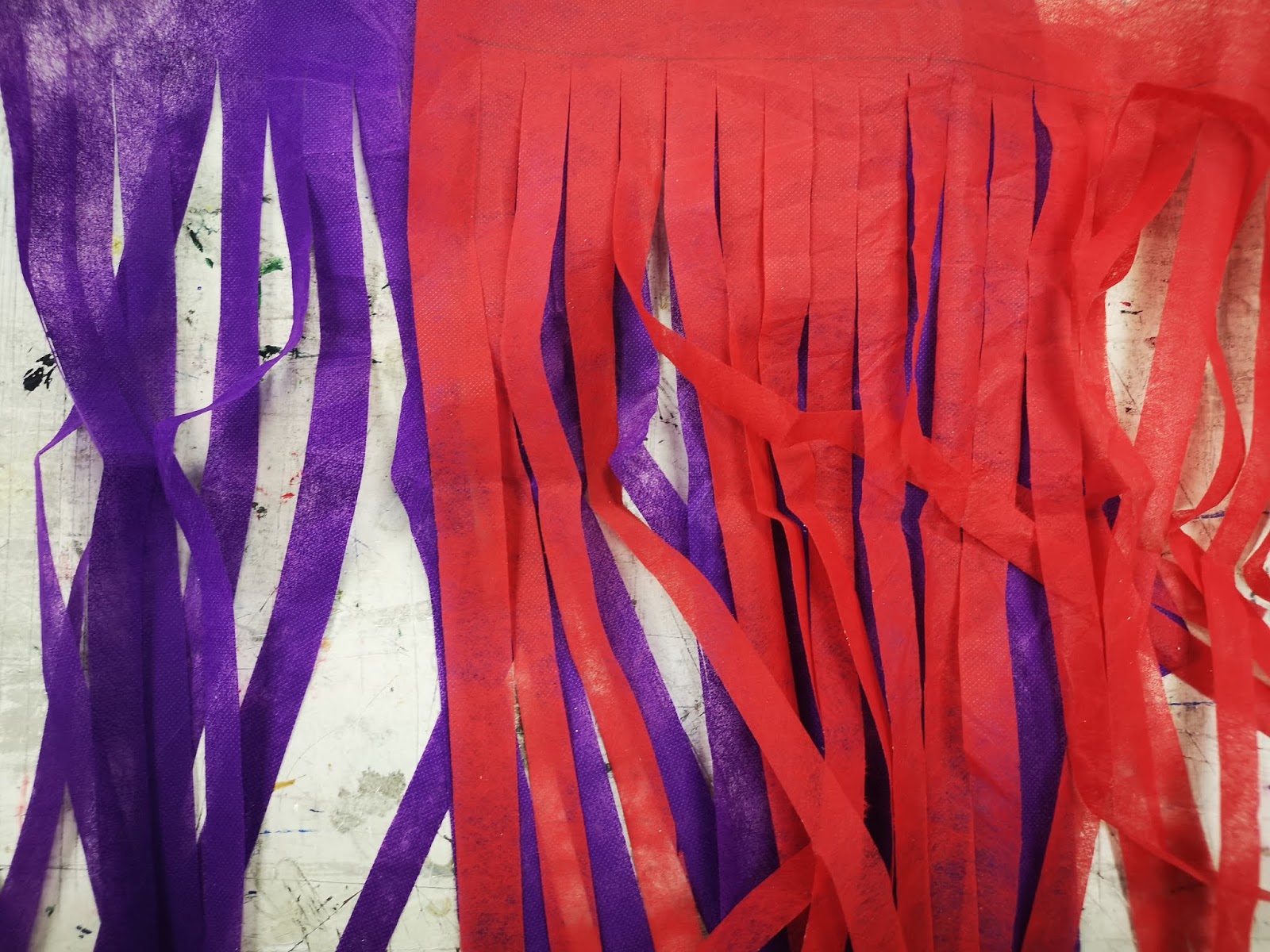 |
| Fig 6.20 Cut flower wrappers |
After cutting them, I glued them onto an A4 sized cardboard.
 |
| Fig 6.21 Flower wrappers glued onto A4 sized cardboard |
Then I started to weave the wrappers together. It was quite a long process and it took me a lot of patience to finish it up.
 |
| Fig 6.22 Weaving the flower wrappers |
After I was done with the weaving, I arranged the seashells (and a snail shell from Ms Sherry) onto the board. I did several layouts to see which was the most suitable one.
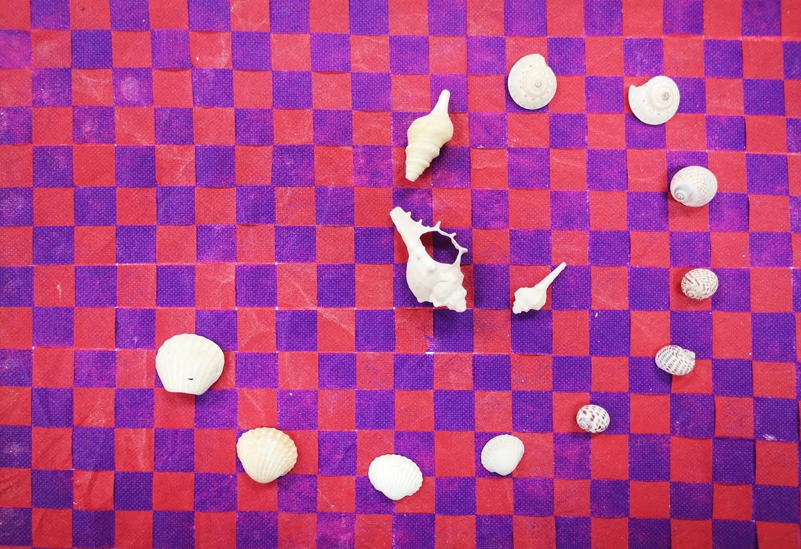 |
| Fig 6.23 Layout 1 |
 |
| Fig 6.24 Layout 2 |
I finally decided on the final layout as seen below. I used the hot glue gun to stick the shells onto the board.
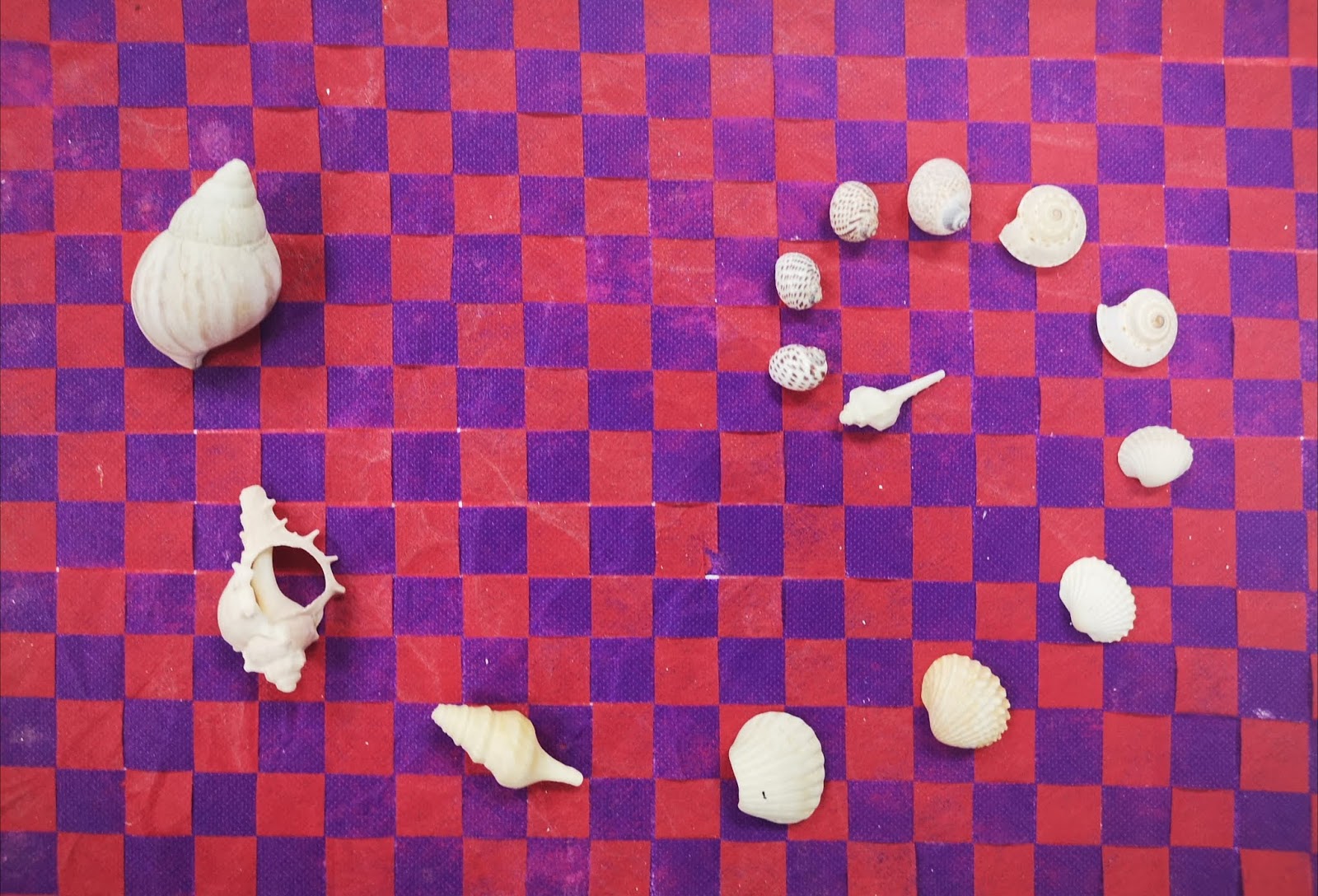 |
| Fig 6.25 Final layout |
Feedback:
For the critique session, the class was divided into six groups where one artwork was chosen to be presented and critiqued. My artwork was chosen to be displayed. Other students said that it was nice. Ms Sherry said that the contrasting colors between the light colored shells and dark colored background made the whole artwork stand out even more. It was a successful piece of artwork.
Week 4 (17.03.2019) and Week 5 (23.09.2019)
Lecture 4: Pattern, Repetition and Texture
1. Pattern: a repetition of more than one design element working in
concert with each other
Types of patterns: meanders, branching, waves, spiral
Meanders: sinuous bends that streams and rivers sometimes
make, which lend the name to anything with a snaking, winding, convoluted path.
 |
| Fig 4.1 NASA/USGS - Meandering Wadis, Southeastern Jordan, 2001 |
Branching and circulation: like trees
 |
| Fig 4.2 Natalie Blake - Fiddlehead, large, porcelain, 15 x 5.5 in. |
Waves: like ocean waves, sine waves, sound waves, ripples,
etc., and all the designs they inspire
 |
| Fig 4.3 Akira Satake - kohiki teapot, 8.5 x 5 x 4.5 in. |
Spirals: winding and continuous
 |
| Fig 4.4 Gustav Klimt - The Tree Of Life, 1909, mural |
2. Repetition: repeating a single element many times in a design
Effect: creates a sense of tension and a deeper meaning
Function: to improve experience (commonly used in web design)
 |
| Fig 4.5 Repetition |
3. Texture: refers to the surface quality in a work of art
a. Visual texture: illusion
on the surface’s texture
- Decorative texture: Decorative texture "decorates a surface". Texture is added to embellish the surface either that usually contains some uniformity.
 |
| Fig 4.6 Decorative texture |
- Spontaneous texture: focuses more on the process of the visual creation; the marks of texture made also creates the shapes. These are often "accidental" forms that create texture.
 |
| Fig 4.7 Spontaneous texture |
- Mechanical texture: texture created by special mechanical means. An example of this would be photography; the grains and/or screen pattern that is often found in printing creates texture on the surface.
 |
| Fig 4.8 Mechanical texture |
b. Hypertexture: : realistic simulated surface texture produced by adding small distortions across the surface of an object
 |
| Fig 4.9 Hypertexture |
Texture in art:
- Actual texture: combination of how the painting looks, and how it feels on being touched
 |
| Fig 4.10 Impasto technique with oil painting |
- Abstracted texture: does not directly represent the object it is connected with, but the concept of the object is translated in textural patterns
 |
| Fig 4.11 Abstract art painting by Megan Aroon Duncanson (MADART) |
- Simulated texture: involves drawing the visual effect of texture without actually adding it. For instance, a texture may be cooked to look like something other than paint on a curve surface.
 |
| Fig 4.12 Cataract 3, painted in 1967 by Bridget Riley |
- Invented texture: a creative way of adding alternate
materials to create an interesting texture
 |
| Fig 4.13 Robert Delaunay, 1912–13, Le Premier Disque |
4. Surface: to enhance the appearance and functionality
 |
Fig 4.14 Blue denim textile surface
|
Exercise 4:
I brought vegetables, fruits, a knife, palette, brushes and
acrylic paints to class. As you can see in Fig 4.15, these are the materials
used.
 |
| Fig 4.15 Materials used for vegetables and fruits stamp print |
For the
first try, I tried using lemon, okra and lime as they did not require carving.
 |
| Fig 4.16 lemon, okra and lime |
 |
| Fig 4.17 Artwork in progress using lemon, okra and lime |
The
colors were very soothing for the eye and the pattern was going great.
 |
| Fig 4.18 Final artwork using lemon, okra and lime |
My second
work was using a potato which has been carved into a star shape.
 |
| Fig 4.19 Star drawn on potato with permanent marker |
 |
| Fig 4.20 Carving the star shape out |
 |
| Fig 4.21 Carved star tested on paper with pink paint |
 |
| Fig 4.22 Progress on star prints |
I used the
potato star stamp with 3 colors- pink, green and blue to create a pattern.
Surprisingly, the stars were well aligned and pointed enough. It was simple but
the design was good to look at.
 |
Fig 4.23 Final artwork of potato star stamp pattern with 3 colors
|
My third work was using a potato with a man’s face shape. It was not obvious, but I liked the gradient and colours.
 |
| Fig 4.24 Final artwork of man’s face shape pattern |
My fourth
work was done using potato star stamp, lemon, okra and lime. I did not really
like the pattern as they are not well-aligned.
 |
| Fig 4.25 Pattern with potato star stamp, lemon, okra and lime |
Below are the stamps used for the artworks:
 |
| Fig 4.26 stamps used for art prints (one was not used) |
Feedback:
During
critique session, I displayed all 4 works to be given comments by other students
in the class. I cut the comments and compiled them onto a paper. As a summary,
they liked the colors, gradient, combination of shapes and the accuracy of the
star print. However, I could improve by using more texture in some of the
works.
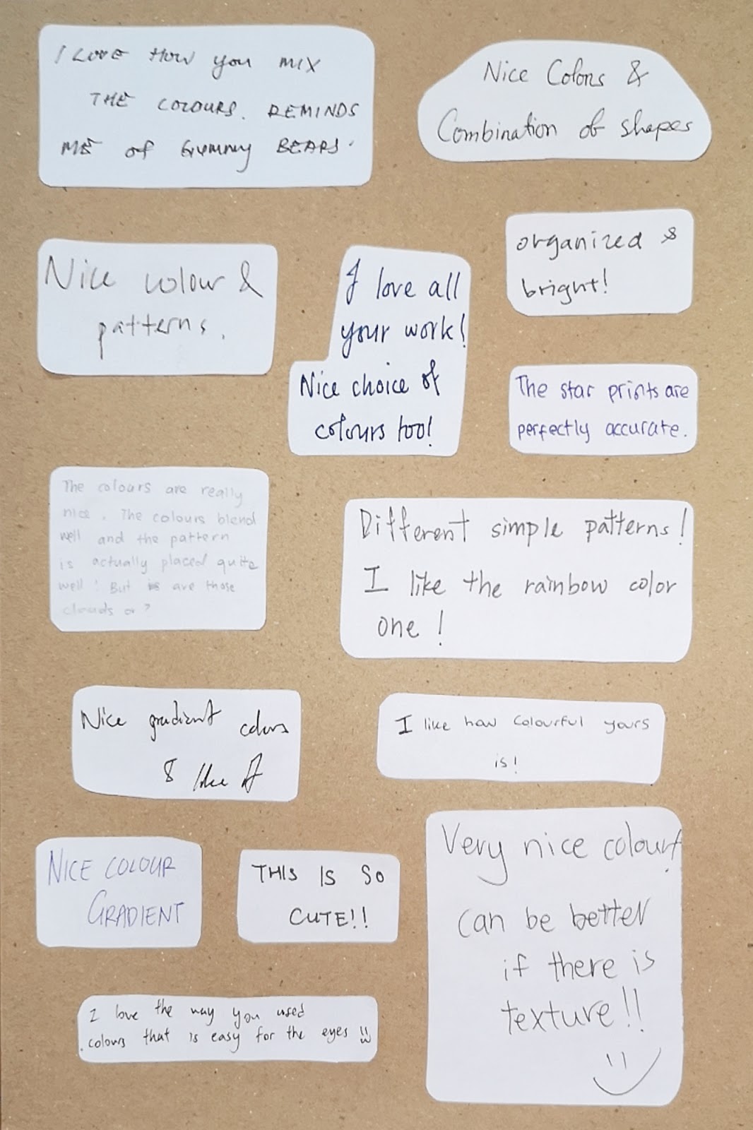 |
| Fig 4.27 Comments from classmates |
Week 3 (10.03.2019)
Lecture 3: Symmetry, Asymmetry and Balance
- Symmetry: The visual quality of repeating parts of an image across an axis, along a path or around a center.
- Asymmetry: Refers to anything that isn't symmetrical.
- Balance: The visual principle of making a design appear equally weighted throughout the composition.
Examples:
 |
| Fig 3.1 The difference between symmetrical and asymmetrical |
 |
| Fig 3.2 The difference between symmetrical and asymmetrical 2 |
 |
| Fig 3.3 The three types of symmetry |
Exercise 3:
Below are my artworks for asymmetry and symmetry:
 |
| Fig 3.4 Landscape with balance achieved in asymmetry |
 | |
|
 |
| Fig 3.6 Final watercolor work of butterfly |
I did several pieces because I was not satisfied with the previous ones. I would also like to have a variety of work to showcase.
Feedback:
Ms Sherry said that it was beautifully done. The watercolor splatters made the composition of the work good (it would be weird if there was a butterfly in the middle of a piece of blank white paper).
Week 2 (03.09.2019)
Lecture 2: Gestalt
Definition of gestalt: an organized whole that is perceived as more than the sum of its parts
My own understanding was that it is a shape formation where the brain automatically connects shapes and spaces.
Examples:
 |
| Fig 2.1 Gestalt examples |
 |
| Fig 2.2 Gestalt explanation |
 |
| Fig 2.3 Gestalt explanation on continuity |
 |
| Fig 2.4 Gestalt used in FedEx logo (arrow in "E" and "X") |
Exercise 2:
Below are my artworks for gestalt:
Below are my artworks for gestalt:
 |
| Fig 2.5 First work for gestalt |
This work (Fig 2.5) was not gestalt so I did 3 more works to be presented in week 4.
 |
| Fig 2.6 A gun and syringe as a symbol of war and drugs |
I was not satisfied with this work because I was afraid that it was not gestalt. This was because I did not use figure ground theory.
 |
| Fig 2.7 Smoke from a cigarette taking the shape of a skull |
I was inspired to do this as smoking is bad for health and often leads to cancer and death. Therefore, I made this artwork to bring out the message intended.
 |
| Fig 2.8 Shampoo bottles and a comb gestalt |
This is a very simple piece but it shows gestalt very easily so I am satisfied with it. Ms Sherry stated that the composition was not good but the gestalt is there.
Feedback:
Ms Sherry stated that the composition was not good but the gestalt is there.
Week 1 (26.08.2019)
Lecture 1: Contrast
Miss Sherry gave us an introduction on the module requirements.
Contrast:
The state of being strikingly different from something else in juxtaposition or close association.
Contrast refers to the arrangement of opposite elements (light vs. dark colors, rough vs. smooth textures, large vs. small shapes, etc.) in a piece so as to create visual interest, excitement and drama.
Examples online:
 |
| Fig 1.1 Michael Jackson black and white contrast |
 |
| Fig 1.2 Contrast of different color |
 |
| Fig 1.3 Contrast with various elements |
Exercise 1:
Our assignment was to make a contrast artwork with black and white A4 paper. Initially, I thought of making an artwork which was half circle and half square but I didn't like it because it was not balanced. I then thought of another design with two triangles where one represented life and another was afterlife (like an hourglass) but it looked weird so I didn't go with that design.
I made the circle contrast artwork which looked like radio waves (Fig 1.5) but it didn't look as aesthetic as the minimalist circle artwork. My idea for this final artwork (Fig 1.6) is based on minimalism and simplicity.
 |
| Fig 1.4 Draft for two designs |
 |
| Fig 1.5 Radio waves circle |
 |
| Fig 1.6 Final minimalist contrast artwork |
This was my final work (Fig 1.6) to be critiqued in the critique session in class.
Feedback:
Ms Sherry stated that my artwork was simple. It was not tiring to look at.
After that, I still was not satisfied so I did another work after the class which is as below:
 | |
| Fig 1.8 Human eating burger |


Comments
Post a Comment